Showing posts with label altenew. Show all posts

01 January, 2020

Arty Divas DT 31 Dec - Working on my AECP


Hi Lovelies!

Today is Challenge 12 at Arty Divas.  This is a FORTNIGHTLY "anything goes" (any type of project and any theme) challenge with a design team who makes projects showcasing the sponsor who often offers PRIZES!

This week there is no sponsor so we had free reign!

My choice is Altenew and it requires a backstory.

I joined their certification program almost a year ago and I hoped to complete at least Level 1 during 2019.  Easy right?  But then January became June and then June became the business end of December so I had an internal freak out.

Each level consists of 10 classes and you submit a project based on each class.  Each class consists of 10 short lessons.  You don't have to do one for each lesson, but in order to dip my toes in, I'm going tp.  And to help me get into the groove of making something every day during 2020.  I wonder how long that will last?  šŸ˜‚šŸ˜‚šŸ˜‚

It's not a resolution, just trying to catch up with layouts and other projects.  I find it's much easier when i make stuff regularly,  I feel so rusty if I let time lapse between makes!  Silly I know.


Anyway I chose to start with the class called "All About Layering" and it's free to take in Altenew's Altenew Academy.  It's taught by Nicole Picadura.  I didn't have the exact stamps she used (which is fine) but I buy particular types of stamps and avoid certain types.

For the first card she used a set where the coloured part of the images is deliberately offset to look like watercolour.  I used a combination of Botanical Garden and Peony Bouquet sets and chose the layers that look most similar to a loose watercolour taking care to offset it.

The sentiment seemed to slot into a natural spot but getting a clean image with the Label Love set was touch. Mine at least seemed to be carved really shallow so to get clear words you need little ink, but then you get a blotchy background.

Tp get a lovely solid background, in flows into the recesses of the words and obscured them.  Yes I did season the stamp and all that stuff.  I'll keep playing with them and see if I can get them to stamp better.


The sequins (from Spiegelmom Scraps adhered with my beloved Glue Dots) were not in the most aesthetic location.  They are hiding a multitude of sins caused by getting ink on my fingers and transferring it unwittingly.

I used adhesive foam to attach the card from to the base.  It has adhesive on one side and typically I add Glue Dots to the other.  My usual Kokuyo adhesive is possibly not strong enough and I'd hate for a card to fall apart.

The second card needed stamps with an outline that had a kind of pattern almost filling in image,  More like the butterflies and a tiny bit like the flower.  Just a single layer of stamping and die cutting.  I have the dies, but fussy cut instead partly because I needed to remove the leaves from the flower which would have stamped pink,  I don;t always cut legs and antennae when I fussy cut insects, but I did this time!  I enjoy fussy cutting so 🤷🤷🤷

The other reason is because the Big Shot acts as a door stop to prevent a certain Fat Cat doing his best Jack Nicholson impression and tormenting his sister.

You gotta do what you gotta do, right? 🤷


So Back to my card for Lesson 2...(tangents are regular part of this bloggy Mama, I'm afraid!)...Most of the cut images are on foam with some elements stamps directly on the card.  Mt method for doing this differed from Nicole's.  I positioned my elements and very lightly traced around them then stamped first.  It's pretty forgiving so I can fiddle with the elements later to get it to look the way I want to.

My clear Wink of Stella was singing its swan song, and with several squeezes as firm as my arthritic fingers could do, she sputtered and coughed and kinda flowed into the exact centre of the flower!  So pretty, but unfortunately I wanted a sequin there all along! 😭

Add a few more sequins in strategic places to hide some unintended marks and I think it's done.


My aim is to complete the remaining 8 lessons and my final submission for this class this week.  I don't think I'm going to be doing a full card for each lesson in each class for each level, but if something inspires me, then maybe I'll do a few here and there... Or if it's a foreign concept like CAS when I'm on Team Moar. šŸ™ˆšŸ™ˆšŸ™ˆ

I fear much of the lessons have the CAS vibe so it's going to be an interesting ride!  Hold on tight cos I'm about to push the nitrous to boost my way through. (what can I say, I'm a Boy mama and I love cars!)


So on that note I'm going so sign off and leave you with a couple of bloopers - aka photobombng cats cos I know you love those, right??


 Love and crafty cardmaking,


09 November, 2019

Project 3 for Fall/Winter Coffee Lovers Hop

Hello Lovelies!

I'm pretty sure this is going to be my last project for the hop.  I know I said I'd try to keep going past the official linky closure, but I'm behind in all-the-things! 😫

I have partial projects from years past that I hoped to finish, but let's review at the next one?

This one is for the tea drinkers out there.  I used the teapot stamp and die from Stampin Up and a cup and saucer stamp and die from Altenew.  I heat embossed in black on the vellum with the intention of using rub-ons inspired by Sara Scraps in this YouTube video.  

I cut each shape in white cardstock and vellum (although the vellum cutting turned out a bit hit-and-miss).  I'm wondering whether the magnets in my magnetic platform are a bit dodgy now?  I know you have to be careful where you place the dies, but they seemed better when in was new. 🤷

I used Glue Dots to adhere the vellum in strategic places (my Kokuyo dot roller goes on as tiny pink hearts which will show for sure!!) then I layered up some standard card bases (one tent fold and one landscape) with 6x6 paper (and a doily) and stamp sentiments from the Vintage Teacup set by Altenew.  

I wanted to keep these fairly simple.  I prefer the red and pink one better.  Maybe it's the placement of the sentiment of the other one I'm not a fan of?  Can you see the Wink of Stella on the flowers printed on the paper?  A subtle detail, but I liked it a bit better after that.  Maybe I just need to keep adding MOAR?!


OK now to the giveaway part:

 
Giveaway CLOSED

šŸ“Œ I have three items (and a bonus fourth prize) to give away (pictured below) and I'll pull three names for the first three prizes.
šŸ“ŒFor the  fourth "bonus" prize: it will go to someone who has entered the main blog hop (please let me know your project numbers if you would like to be considered.  You can wait til the blog hop is over to do this since they change sometimes.)
šŸ“Œ The first name drawn gets first choice, second name gets second choice and so on.  Bonus prize will be TallCraftyDude's favourite project!
šŸ“Œ This Giveaway is NOT SPONSORED.  I purchased the prizes especially for this giveaway.  This year I picked stuff other than just stamp sets to mix it up a bit!  In the even the items I purchased are on back order, I'll purchase something similar in their place and update the list below. Thanks for understanding!

The prizes you get to pick from are:

This pair of embossing folders - "On the Go" by Tim Holtz and "Coffee Stains" by Creative Expressions


Framelits Die & Stamp Set By Crafty Chica for Sizzix called "Mi Cafecito Mi Amor"


Coffeesaurus Stamp Set By Gerda Steiner


Lastly, the bonus prize will be a pack containing a 6x6 "Coffee" paper pad by Echo Park and some coffee themed embellishments.  This prize will be awarded to TallCraftyDude's favourite project so PLEASE LET ME KNOW WHAT NUMBERS IN THE MAIN HOP YOUR PROJECTS ARE IF YOU WISH TO BE CONSIDERED FOR THIS PRIZE!  THANK YOU SO MUCH!


You will receive an entry (or entries) for each of the following.  You absolutely don't have to do everything - just how ever many you like.

If you have previously followed my socials then these are already counted for you!  (unfollowers will not be counted)
šŸ“Œ The giveaway will remain open until 11:59PM AEDT on Sunday 10 November.  Please visit THIS SITE to calculate in your own timezone
šŸ“Œ The winners will be drawn randomly on Tues 12 Nov so PLEASE CHECK BACK HERE
❗If the winner and I can't make contact by Tues 19 Nov, I will have to draw a new winner since I need to get these prizes out all together.
❗Please try to email me at alex@pinkcraftymama.com This really is the easiest way for me to get in touch with you since not all blogger profiles have an email attached and if you JUST leave comments, I have no other place to search for you.

So...what do you have to do to get entries?
šŸµSubscribe to my YouTube channel - 3 entries
https://www.youtube.com/user/PinkCraftyMamaAlex
šŸµ Follow this blog - 3 entries (in the left sidebar)
šŸµ Follow me on Facebook - 2 entries
šŸµ Follow me on Instagram - 1 entry
šŸµ Comment (once per day per person) on a post between now and the close of the giveaway - 1 entry per post

I don't yet know how many makes I'll have done between now and then, but it will be at least three.  The more love from you guys the better the chances of me getting crafty which gives you more chances to enter.  I may continue with extra "unofficial" projects after the Hop actually ends, so be sure to keep checking back here since you get an entry for commenting!

Click here for Project 1

So today...if you want to leave a comment, tell me if you're a tea drinker, do you like flavourned  blends or just "plain" tea? (or anything else if this doesn't grab you) and please don't hesitate to email me with any questions at alex@pinkcraftymama.com


* ⬅⬅⬅ Acronyms and strange terms in left sidebar! 

Love and copious cups of coffee!


18 June, 2019

TTCRD 18 June DT Project

 Hi Lovelies!

Today is challenge day for Design Team B for the Through The Craft Room Door Challenge.  This is a WEEKLY "anything goes" (any type of project and any theme) challenge with 2 design teams who alternate weeks to make projects showcasing the sponsor who often offers PRIZES!

This week's sponsor is Sheep Ski Designs. You can read a bit about them below.
Prize: 3 Images

 
"Living in Leeds, Yorkshire in the UK, working full time as a Management Accountant, currently working on 2 design teams and an obsessive crafter and creator of cards. I have no actual style as yet but do love the unusual and quirky. I may be known for producing cards in soft pastel colours.
I love anything arty. I've always drawn stuff, for as long as I can remember. In my younger days I sold a few watercolour paintings. I recently found mixed media which is a joy and love creating canvases with flowers.
I had a battle with digital drawing for about a year and finally found some software I could gel with. January 2016 a challenge team I worked on was short of a designer's images to create with so I drew some. I opened my shop a month later so I could sponsor challenges and give something back to the crafting world, to the lovely ladies who have supported me on my journey.
I've a Facebook group SheepSki Designs where I hold challenges, some for fun to win digis as well as my monthly card challenge. I've a SheepSki Designs challenge blog as well. Things are growing slowly (thankfully) so I still manage to spend at least a little time with my hubby
Welcome to my world"

Well...I'm not really sure where to start with this one!  You know my reputation for something always going wrong?


This time it was a total disaster!  I'm not just being overly dramatic either!  I mean having an unusable card when you're already running a bit behind schedule to submit it for the Design Team post!

It's a good thing this Pink Crafty Mama thrives on adrenaline!  Well this is what happened:

I decided I wanted to work with this cat image by our sponsor.  I suspected it wouldn't be the easiest to colour with Copics, but I already did a watercolour cat card so I wanted to mix it up (says she who is always making cat cards -  KNOW! 🤦).  The lines were really simple and I wasn't sure I was up for making a galaxy background with Copic markers, although I could definitely do it with Distress Ink.

All I have to do is mask the coloured images then do the galaxy sky the usual way.  I wanted to practice colouring different kinds of cat coats and I even managed to get a darkish lilac type of coat coloured!  Darker was OK because it's night after all.

This guy is grey and white rather than lilac, but you can see what drew me to the image with the cats on the roof!


After everything but the sky was coloured, I stick down my sheet with Removable Glue Dots and applied masking fluid...

BIG MISTAKE!!!

I should have done a test patch, but I felt so confident at this point (I really should have known better, since nothing really went wrong so far) and even liked my colouring and everything!

Xpress-It Blending Card is generally more delicate than other paper.  Not only did the masking fluid seem to "suck" a fair amount of colour out of my images, but it tore in some areas.  I was devastated!  I also had a deadline!


OK, Big girl pants on and time to Plan B.

Let's paper piece it.  I don't even need to choose paper with realistic textures although I did for the sky with the amazing Altenew Celestial paper pad.  Those galaxy skies are amazing!  I also used a Kaisercraft Australian paper  for the roof since it had rusty corrugated iron texture.

A grey polkadot and brown cork for the cats and I traced the moon shape onto an actual moon from Shimelle's Starshine paper pad to try giving it a bit of that texture.  You do need to know how ro ajust your printer tray to accomodate different sized apers (I used 6x6) and also adjusted it in my software so I could see how the image fit on the paper.

Naturally I couldn't resist the lure of clear Wink of Stella lightly brushed over the moon before adding the sentiment on foam squares.

The sentiment was stamped using Altenew's To The Moon stamp set in Midnight Violet and Pure Graphite Crisp Inks.  Micro Glue Dots were the ONLY thing that would hold the tiny stars to the slightly shiny background paper.

Surprisingly, it turned out better than  although, although far from what I had in mind.

I Love You to the Moon and Back Cat Card


So naturally it makes me wonder how could I have made my original plan work.  My first thought was using masking sheets.  But it's a digi stamp so there is no way I can put one of those through the printer.

I suppose using a template cut from images printed on paper or light cardstock then using them to trace around onto the sheets could work, but DEFINITELY TEST FIRST!

Using an alternative paper was another possibility.  Many people use Neenah Solar While for Copic colouring. I have it in the 110lb weight and it's definitely too thick for my printer.  I'm waiting for the 80lb to be restocked in A4 size.  Again, before assuming masking with anything will work with Neenah, DO A TEST FIRST!

I always like to revisit any project which has not turned out the way I wanted and this will be no exception.  Kind of like not wanting to be beaten by paper! šŸ™ˆšŸ˜‚

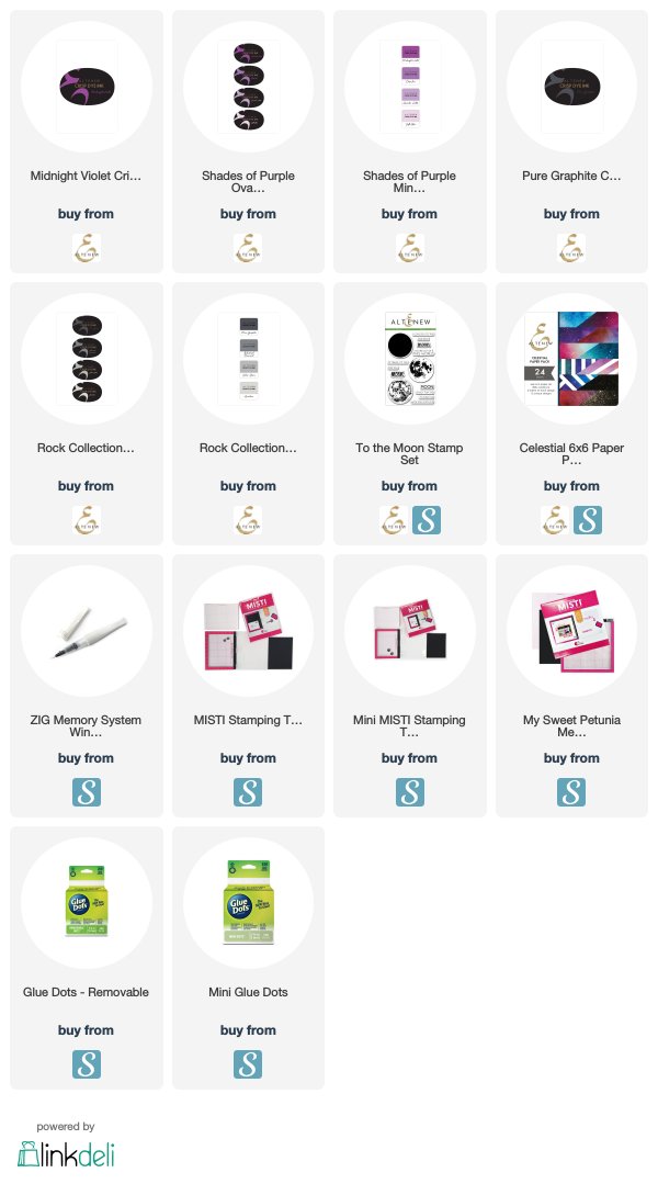
SUPPLIES:

The products I used (or similar) are listed below:
This post may contain affiliate links.  By clicking on the items or making a purchase (at NO additional cost to you) you help support this site, so a big, pink THANK YOU! 
Please rest assured I only recommend products I personally love!

Love and minimal mistakes,


31 December, 2018

Altenew Inspiration Challenge - A Pop Art Card


Altenew is hosting their annual Year in Review Inspiration Challenge which I have to say is a very cool idea!


So what does it involve?  Well the instructions taken from their blog post linked above are:

"to take inspiration from one of the past Inspiration Challenge photos and be inspired to create stunning projects! Maybe take the colors, the theme, the composition, or something else from the photo – as long as you get inspired, then it’s fine by us".  

The inspiration images are presented in this  collage: ➡➡➡

So now what?  

Well the first thing that occured to me (probably subconciously inspired by the grid-like presentation of the past challenge photos) was that I had planned to do a grid style project from the recent Coffee Lovers Blog Hop, but ran out of time.  šŸ˜’

The three colours in each of the past challenge photos further reminded me of Andy Warhol style pop art where the background of each section is one colour, outline of the object is a second colour and background of the object is a third.

It seemed simple enough, but Andy Warhol used silk screen technique so rich, vibrant colours could be layered on top of one other without bleeding and lighter colours could be painted on top of darker ones.

The way I saw it, I had three options:

1.  Heat embossing (with coloured embossing powder) ideally onto a second colour of cardstock and cut out and stuck onto a third colour.  The problem is that I only have neutral colours of embossing powder.

2.  Dye ink image stamped onto white cardstock and coloured with alcohol markers.  This method would have given the vibrancy of colour, but even alcohol markers going over a lighter dye ink can alter the colour of the ink and it would look messy and not give a good distinction between two out of the three colours

3.  Stamp the image in Archival ink onto white and watercolour before sticking onto background colour.  


This is eventually what I did.  

I opted to use Distress Ink as the watercolour since I know it can be successfully layered over Archival, and the changing of the stamped image only happened when the watercolour was comparably dark.

It's far from ideal because watercolour isn't as rich and still looks a bit blotchy.  Maybe if I had used watercolour paper rather than smooth white cardstock I could have worked with it a bit more before the paper threatened to start balling up. šŸ˜–šŸ˜–šŸ˜–

I wasn't trying to be overly accurate in terms of the direction of the light source, but it was a little bit inevitable since the coverage was not going to be even regardless of what I tried.

The cards actually do look a little better "in real life" from this perspective since either a flash or harsh sunlight seemed to accentuate the issue.

As far as the images themselves went, I was certainly spoiled for choice when it came to images coffee paraphernalia by Altenew.  Unfortunately many were too large to use this technique on and still fit onto a card front.

I picked the dripolator from the Coffee Love stamp set and the tea cup with the lemon from the Tea Time stamp set.  Shaky hands and shortage of time meant I had to omit the lemon and juice drops and just cut out the cup.  😔

I picked 9 colour schemes from the above inspiration photos since I could see either a 2x3 or 3x3 configuration working.  It also depended partly on which ink and cardstock colours I had and how close they were to the inspiration.  I stamped all nine for both images since it was easier and I'd figure out which 5 to choose when I got to that point.


It became a production line of sorts and would work quite well when making a set of cards since multiple images could be stamped with a MISTI (which I might add was invaluable in building up an intensity of colour that made me happy).

With the three leftover dripolators I ended up making a bonus card!  2018 has definitely been a year where I have been trying hard to be more efficient and if I can make one card, I can just as easily do two or more. 


Now it wouldn't be me if something didn't go wrong, right? šŸ˜‚. Well the sewing machine was acting up (again) and I wasn't planning on adding any extra embellies (shocking I know!), I did end up having to hide a few of the more obvious imperfections create design features. šŸ˜‰ And let's not forget the text size in today;s post.  I've tried formating it the best I can, but some still doesn't want to co-operate.

Altenew came through once again with the sentiments from Coffee Love, Coffee Talk and Vintage Teacup. 

Well this was definitely an interesting exercise and I'd love to try this style of card again for sure and I'd try different methods to see whether I can get a better result.


Love and copious colourful creations,