20 February, 2018

February Stick It Down/Scrap the Boys Collaboration Challenge


This month, Stick it Down and Scrap the Boys have collaborated and issued each other with a challenge.


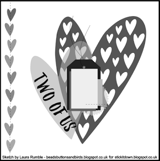
One of these is this sketch challenge (not sure who issued to who, thought).  It's quite different to what I usually do.  Not in the least because it involves a cut file and I haven't got a Silhouette (yet - that might change this week...ETA may have already done so - eek!).

The heart (there is also a star) cut file reminded me of Paige Evans' "Paige Kit" from her first collection "Fancy Free".

I wasn't going to buy any of the kits because the're not really my style (at least they weren't when they first came out) and I certainly wasn't going to follow the kit as it was by just sticking the die cut onto the printed sheet with the different "papers" already there.  I didn't see the point.  There was so little left to do that I might as well buy a ready made scrapbook page.  I enjoy the process of scrapbooking not just the end result.


I bought two kits on purpose so I could cut up the triangles on one to use as templates.  I'm glad I did since I want to make this page again - perhaps in my wedding album.

It would have been easier to stick the pieces down onto the other printed sheet to keep the alignment perfect, but I still needed it so I stuck them to scrap paper and cut it all out when I was done.
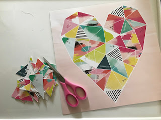


There will always be a decrease in accuracy so a little jiggling was required but we got there in the end.

I thought 6x6 paper pads were the way to go and I went with Amy Tangerine's "Better Together" since I had two for some reason.  I also mixed in Paige Evans's "Oh My Heart" which blended quite well


I only glued lightly around the edge and stitched the inside bits down with a straight stitch on the sewing machine.


For some reason I felt smearing embossing paste around the outside of the heart would be a good idea.  It probably would have been but I keep forgetting that all types of paste marked "pearlescent" seem to dry a kinda silvery colour rather than the slightly shimmery pearl white I wanted. It meant gold accents were out of the question.  

They all looked stupid.


I think I wanted to cover more of the ombre green.  I don't usually use green but I was being brave today.  

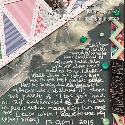
Normally I have the ombre going top to bottom, but for some reason I like it going left to right and hoped I could journal in white on the darker side.  

This die cut was larger than the one on the sketch so to make enough room for everything else I wanted on the page I pushed it off the edge in 2 areas.

Once the past was dry and I lightly tacked down the large heart (which I put going off the page) I zig zag stitched the outer edge.


Next step was punching and/or die cutting (manually) all those hearts.  It sounds faster than it was!

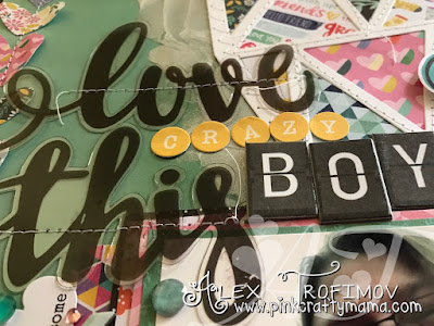
Tack and stitch then layer papers behind the photo and figure out the extra stickers for the title.

This was supposed to go in our yearly family album, but each of the 3 or so stories I could think of seemed to fit in better with SmallCraftyDude's album.  The problem is I used pink on this layout and I challenged myself not to use it in his album.


 I was lamenting this when he told me it was OK and to go ahead and put it in his album and he didn't mind.

This is the same kid who on the first day of Year 8 flatly refused (at first) to hold the cut apart from Shimelle's "Starshine" collection called "Mariner".  He held up the number 7 with no issue the year before. 🤷
Max: No way am I holding THAT!
Me: Why not?  What's wrong with it?
Max: It's PINK!


Yes he was serious I'm sad to say.  Some death threats hissed in his ear and he reluctantly complied.

I decided to go easy on the pink for the punched hearts, layers and embellies after his generous concession.

The acetate part of the title needed to be stitched down in order to keep it in place and I liked the continuity of the stitching.  I also tried to keep loose threads where possible for continuity.


I wanted to include a few embellishments because I never don't want to and it was a bit tricky getting everything to "work" but we got thee in the end and I'm more or less satisfied.  It's the usual first-layout-in-a-long-time thing.


On the bright side, I'm starting another one today ad so far things have moved much more easily.

Well this Crafty Mama has a lot to get through today,  Some of it is fun like actually making and plenty is the more housekeepingy, behind-the-scenes boringness that goes with being a Crafty Mama.

love and successful scrapbooking!

15 February, 2018

Counterfeit Kit Challenge for February

And we're only halfway into the month! 🙄


I did actually start right at the beginning though,  That counts, right?

So...for a long time I was wondering when CKC (Counterfeit Kit Challenge) would use a Noel Mignon kit.  Her kits are huuuge and mine always tend to be as well.  I figured if the inspiration was a Noel Mignon kit then the size of mine wouldn't be quite so embarrassing.  Sadly nope.  My huge kit just grew in proportion to the Noel Mignon one.

It also probably didn't help that the inspo kit was gorgeous!  It had all the things I love - vintage, pink, aqua...doilies, bows, flowers...💕💕💕

So be prepared for a long, drawn out blog post - it's not like I ever do that normally, right?? 😂

Without further ado, the inspiration kit is called:

 Weekend in Paris Classic Kit 


...and there is also (what I think is) a pocket page kit to go along with it called:

Weekend in Paris Daily Diary Kit 


So the question is how am I going to approach this reveal? 🤔

Before I say or do anything else, I want you to keep two thinks in mind, firstly I am pretending I bought BOTH the Classic and the Daily Diary Kit from Noel Mignon as I pull out supplies.  And extra papers if she does that.  So it's going to be big.  I feel a little trapped in a small kit.

The second thing is that I intend to use this kit indefinitely - way past the end of February.  I did that with Last month's kit.  I kept culling until January was almost up and I just didn't even bother blogging about it.  I will still keep using it but didn't want it to happen again.

Maybe one day I'll get the hang of this.

I started analyzing the kit in my usual way in terms of setting out the colours and motifs down in front of me to see how much I wanted to interpret fairly literally and how much I wanted to swap out for something else that suited me better.  I usually do this process on paper.

This one-for-one approach of choosing a paper and embellishment to represent each one in the kit clearly didn't work this time.

 I chose papers which fit in with colour and/or theme and didn't care too much about quantity,  (clearly).  What I will do is just show you a selection of papers/ embellishments which represent the feel of the kit in all the different colours and motifs I identified.


Before I even go into  colours, I feel that some paper collections set the tone of the kit and in this case it's Maggie Holmes' "Carousel" line which seems to dictate colour and some theme as well...except I don't it yet.  It was her "new" collection except now that Creativation saw the release of her NEW new collection last month...

I decided at this point that Maggie Holmes and Crate Paper in general would be a solid foundation for a vintage Parisian kit.  I used "Chasing Dreams" in place of "Carousel" but they go with the theme just as nicely.

I also added a few more random papers by Crate (with the exception of the top line with is October afternoon).  Some are pretty old and others more recent but I think they will all work.


I got really excited when I saw a few papers from Carta Bella's Metropolitan Girl,  That is all about shopping in Paris and I have the perfect photos and story I've been saving for them! prefer the colours in Carousel though, so like the original Noel Mignon kit, I tended to choose papers more like those by Crate Paper.


I added most of the Metropolitan Girl line to my kit!


When going through the list of supplies one by one (and YouTube unboxing videos when available are a big help) it's easy to see which colours predominate and which ones play a more supporting role.

The first thing that stuck out was that the full spectrum of aqua/turquoise from light to darker teal and  represented along with lots of pink.  There were a few greens too, but mostly aqua.

The pinks tended towards the warm side with some being peachy and almost coral.  I decided to try to include a wider range of pinks in my kit because...well pink.

Black/White and Black/Cream patterns also play a large role too.  All the colours so far are really rather Parisian, aren't they? There was also yellow, gold and splashes of red and blue

So what about themes and motifs?  I tended to mix them between paper and embellishment so I've listed them together eg I picked paper with doilies or cameras when WIP had them as embellishments (and vice versa)

The motifs were in keeping with the name - a weekend in Paris of shopping, sightseeing, primping and relaxing in cafes perhaps?   

Julene who chose the this month's kit also put together a Pinterest board for inspiration!  I definitely kept it in mind when making my choices even if was subconscious.


The overall vibe was classic or retro/vintage - nothing super trendy.  Things like:

Flowers
Butterflies
Hearts
Dress forms and fashion
Doilies, bows, lace, fabric
Bunting/banners
Frames, tickets
Scripty words, typography
Vintage camera, music scores, book print
French inspired motifs (Eiffel Tower, bicycles, small cars
Buildings, shopfronts, cityscapes
Vintage marquees, carousels, hot air balloons, kites and
Classic patterns like polka dots, stripes, gingham/plaid
Woodgrain, watercolour wash, maps
Wallpapery patterns brocade, damask and toile
Layered patterns with images of stacked ephemera
Cut-apart sheets or patterns that can be cut into embellishments

And now onto the rest of my choices in my kit - I shall name it:

An Elegant Sufficiency 


Because it pretty well describes how out of control the kit became (in the nicest and most ladylike way - Dowager Countess Violet would be proud!)

When I first started researching the inspiration kit, I remembered these two Anna Griffin papers in my stash which I also felt laid the groundwork along with Crate and Carta Bella's "Metropolitan Girl".


There are many manufacturers or at the very least paper collections which would work well in this kit.  I chose a mix of bright saturated colours and softer more distressed ones, but they all have a vintagey quality in common.  I just needed there to be some more playful styles of pattern and variety of colour to be able to scrapbook a wide range of photos.

The Basic Grey below is a good case in point:

On the left is "Mon Ami" which has a french theme as well as all the right colours.  It's definitely on the more whimsical side.  Then in the middle is a mixed bag of more traditional patterns and on the right is "B-Side" which is very bright and fun but still works.


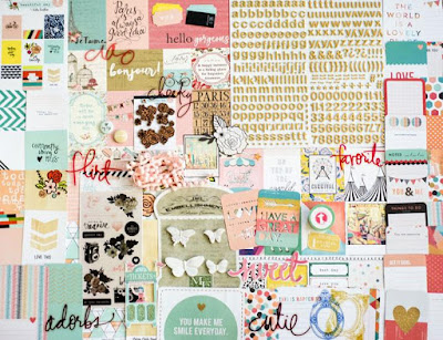
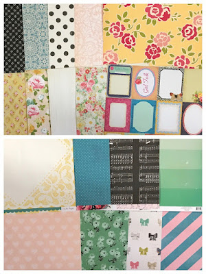
Several collections from Echo Park on the left and Heidi Swapp on the right (except that camera print which is Fancy Pants) and a few from Glitz as well as more HS in the bottom part of the image.


Perfect colours and retro motifs from Shimelle's first Collection:


Ahh My Mind's Eye!  Always good for some vintage fun.  "Find Your Wings and Fly" on the left in both colourways, plenty of "Kate and Co" in the middle since I haven't really used much of it but had it for a long time and on the right "My Story" which has the florals, butterflies. bunting and gold touches.


This one was a bit of a no-brainer - the name was enough of a reason to use it, although the colours and motifs were perfect too - "C'est La Vie" by Pink Paislee


Two collections from Prima - on top is "Anna Marie" with plenty of sewing patterns, dress forms and florals and below that is "Rosarian" which I have quite a bit of but haven't used much.  Time to change that!


Pebbles!  A few from "Walnut Grove" on top and "Tealightful" below.  I admit "Tealightful" is very cutesy and some of the critters may not work with a sophisticated Parisian theme, but tea and cakes (look there are macarons! (NOT MACAROONS)) need representation for sure!


Some Dear Lizzy on top (complete with French phrases) and some Webster's Pages flowery goodness below!


Lastly is the bright "Flower Girl" collection by We R Memory Keepers.  It's vintagey and whimsical and fun all in a single collection and actually one of the first I thought about when I was brainstoming about this kit.  Some of the brighter and more fun collections I included were inspired by this one.


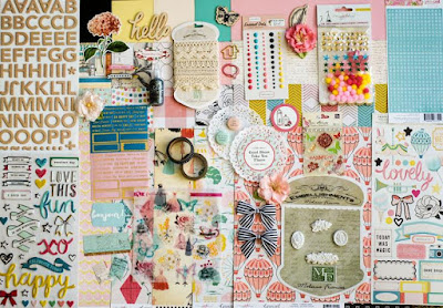
Now here are my embellishments.  Don't judge, ok? 😂 I like lots of stuff on my pages and lots of paper for layering up!  I included stuff that corresponded where possible to the inspiration kit and items that co-ordinated with the papers I chose.  Things from the same collection


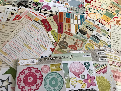
Remember my trusty snack tray from a few months back?  I'm still picking through that along with some washi, rub on pens and loads of those die cut words I can never seem to use use. 


Lastly a few close-ups of some of the French bits of the paper and embellies!


Some French postal goodness from Glitz...


C'est La Vie has plenty of French phrases which an be cut out...


 ...and check out those two papers from Dear Lizzy with the mix of French and English?  


Well congrats on making it this far and I'm ready to use my kit so please keep checking back!  Thanks so much for stopping by!


Love and successful kit curating!


01 February, 2018

Victoria Marie Weekend Challenge: "Old + New"

Victoria Marie is back to having weekend challenges in her Facebook group.  The one running from Friday 26/1 to Monday 29/1 was about Old and New.  The instructions were (in a nutshell):

Title: Old + New
Due: Monday, January 29th by 11:59 pm (CST)
The Challenge: Create a scrapbook page (any size or style) using items from your stash and new products that you recently purchased.
1) You must use at least 3 items from your stash....older elements that you haven’t used in a while. The older, the better!
2) You must use at least 2 new items that have been recently purchased.

(scroll down for full layout)


I manage to finish this one after not crafting at all in December or January!  As is always the case with me and often with others too, it's hard to get back into the groove after a little (or a lot) of tim away,

I also hadn't purchased anything super recently - at least not for scrapbooking.  Cardmaking stamps maybe.  So much so that the "new" collections I still hadn't got around to buying are no longer new since Creativation revealed the new NEW ones these last few weeks. 😮😮😮

Still...I settled for what was newEST and figured anything manufactured in the 12 months since Creativation 2017 was acceptable as NEW.


Old I'm good with!   Have plenty of that on hand and usually the older means the moe precious since many manufacturers and designers are no longer. 😢


I've listed as many supplies as I can easily identify.  There are some odd bits of Thickers which I don't have in original packaging so can't tell you where or when.  At a guess the blue ampersand is Amy Tangerine and the non glittery pink asterisk could be too for that matter,  I didn't count my mixed media items either.
  

New

*Shimelle "Glitter Girl" paper 2017
*Embellishments from "Glitter Girl" - stars from word Thickers, glitter enamel dots, stickers, shaker sticker
*Shimelle "Glitter Girl" washi 2017
*PinkFresh Studio word stickers 2017

In Between

*Amy Tangerine "Better Together" paper 2016
*Shimelle "Starshine" 2016
*Simple Stories "Reset Girl" roller stamp 2016
*Amy Tangerine roller stamps ("Better Together" 2016 and "Finders Keepers" 2015)
*Shimelle Roller Stamp "True Stories" 2015
*Dyan Reaveley "Say it How is is" Stamp set 2013 


Old:

*Love, Elsie "Roxie" paper 2006
*Love, Elsie "Roxie" enamel shapes 2006
*Love, Elsie "Zoe" enamel shapes 2007
*Dear Lizzy "Neapolitan"Roller stamp 2011
*American Crafts Thickers "Rainboots" font in Raspberry Pre-2011
*Hambly Screen Prints Washi 2011


So...I started with a B-side from Any Tan's "Better Together" line.  This is the third of my Dyan Reaveley layouts.  I think I haven't actually told you about my class with her last August!  I must do that!

The layout itself was a hybrid scraplift of one by Shimelle during a recent "Friday Live" on Facebook video and one I had saved from somewhere onto my camera roll.

Problem is that it had no watermark or signature so I thought I wouldn't be able to credit the maker.

Ha!  I'm not giving up that easily!  It had a lot of features that I see in Missy Whidden's work so I started by searching Pinterest for her layouts and if this one popped up I would be on my way to determining it's origin.

It did indeed and led me to a post on the My Mind's Eye blog where the layout was in all it's glory with confirmation that it was indeed made by Missy and remarkably similar to Shimelle's except it had much more mixed media.

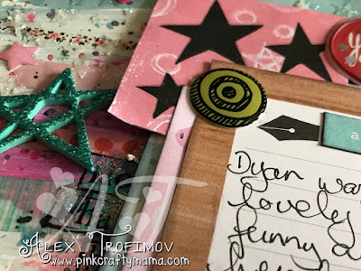
I don't usually use so much mixed media, but making an effort to on layouts pertaining to my classes with Dyan since she is an art journaller.  I'm trying to mix it up with what I normally do so I'm trying something new, but isn't a gross departure from everything I like that makes me me.


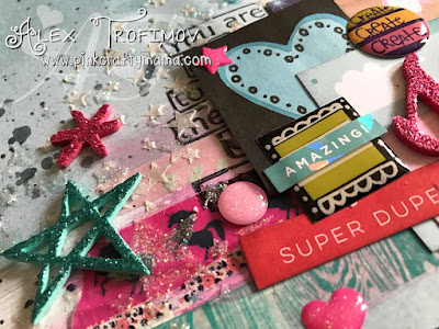
The title used cut-apart letters from Glitter Girl (our initials) and was a nod to the photo being an actual selfie.  I used my Instax Mini 9 which has a selfie mirror on the front.  I love it, but still working out its' quirks.  It tends to require a higher brightness than specified by the camera or else they come out kinda like the old Polaroid.  It's not totally bad since it does give it a vintage look, but when you want colour...


...and I loathe my pred face.  It takes so much for me to post photos of myself online.  I'm trying, but it's hard when the only medicines that help keep Arthur** at bay cause so much collateral damage. 😢

Here is the full layout:

A&D Selfie 


** Acronyms in left sidebar <--


Love and messy mixed media missions!